Colouring A Page
Alright enough of the prep work. Let’s get into the details of the colours.
Here are some tips for making your colours look awesome:
- Put your focal points in high contrast.
If your page/panel is mostly cool, adding warm colours to an object will emphasize that spot. Brightness works the same way. High brightness stands out amongst low brightness (check out your page in grayscale to see the effects of this). Check out this fantastic video by K Michael Russell that explains this in depth.
-
Similarly, use local colour to draw focus. Local colours are the base colours of an item (bananas are yellow) and tend to draw the eye. You can wash unimportant items over with a tint that distorts their colour to allow the reader to almost skip over them. Here’s another video by K Michael Russell on the topic.
-
Know the difference between Standard Black and Rich Black. With CMYK colouring, standard black (using only K values while setting CMY to zero) will not result in absolute black when going to print. This will result in your blacks coming out as more of a dark gray. This can be avoided by adding equal amounts of CMY values to your blacks. Print Ninja summarizes this point well in this article.
-
Use different colour schemes when changing locations.
Not only does it make your art more visually pleasing, but it also clarifies things for the reader. Surprise! A great K Michael Russell video.
-
Avoid using very dark colours. Remember that colours print differently from how they appear on a screen. Colours with very high “K” (black) values become a lot muddier when going to print. Stick to colours with lower “K” values. Another video here.
-
Objects of the same colour are perceived as the same distance away from the reader. This is a consequence of how the brain works when analyzing images. If you have a bright blue object in the foreground and another object with the same colour in the background, the depth of your image will start feeling distorted. Generally you want to stick to a specific tone across each level of depth in your image.
-
Consider adding atmospheric perspective to add depth to a panel. Also known as atmospheric haze or fog, this is the change in appearance of objects as they are viewed at increasing distances through the layers of illuminated air. The further away you go, the more desaturated they become. You see this effect a lot in mountain scenes like this one:
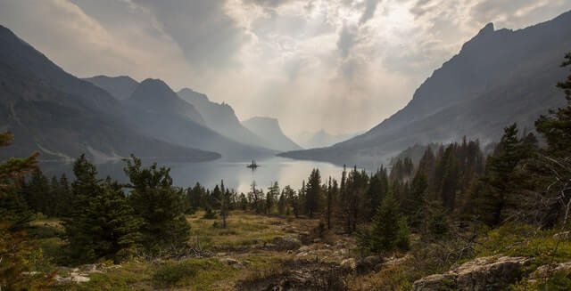
Notice how the mountains in the back are more faded than the ones in the front? This effect can be achieved by desaturating the colours of far away objects and can be enhanced with colour holds.
- Consider the meaning of your colours. Over time, our society has assigned an emotion or symbol to each of the main colours. Because of this, people will often have a subconscious reaction when seeing a specific colour. This meaning varies between cultures (and I warn you to be weary of stereotypes) but one possible assignment is well summarized here and another here.
Table of Contents
Intro
Before You Start
Writing
- Overview
- It All Starts With An Idea
- Thought Dumping
- Outlining
- World Building
- Characters
- Writing Scenes
- Breaking Scenes Down
- Scripts
- Dialogue
- Revision
- Choosing A Title
- Writer's Block
Hiring A Team
- Overview
- Sorting Out Your Budget
- Writing A Solicitation
- Where To Find Your Team
- What Makes A Good Partner
- Contracts
Drawing
Colouring
Lettering
- Overview
- General Tips
- Standard Black vs Rich Black
- Choosing A Font
- Font Types
- When To Bold Text
- Sound Effects
Marketing
Publishing
Printing
- Overview
- Getting Print Ready Files
- Offset vs Digital Printers
- Why Page Count Matters
- Book Formats And Binding Types
- How Many Copies To Print
- Aesthetics
- Tips For Saving Money
- Printer Comparison Table