Page Composition
Comic Book Paper (webapp) - You pick the number of panels in your page and it provides a whole bunch of sample page layouts. Really, really cool.
Advanced Layouts: Paneling Outside the Box (article) - Aaron Diaz
Panel Layout: The Golden Ratio (article) - Making Comics
Power through Composition (video) - Strip Panel Naked
Your first focus when designing a page should be it’s composition: how the panels fit together on the page. One of the best and most efficient methods of doing so is through what we call thumbnails.
For many artists, thumbnails are an essential first step to the drawing process. By very quickly sketching out a page, an artist can determine the key aspects of the page as well as the elements that do and don’t work. The rough nature of the thumbnails also allows the artist to go through a bunch of designs in a short period of time.
It’s important to remember that thumbnails are experimental. They are most definitely not meant to be perfect because you should expect to be throwing out a lot of your designs as you go along. Do yourself a favour and don’t spend an hour filling in all the details of your thumbnails. Save that hard work for the penciling stage.
Here are some tips to make sure your page layout is fully optimized:
- Make sure your panels have a natural reading order.
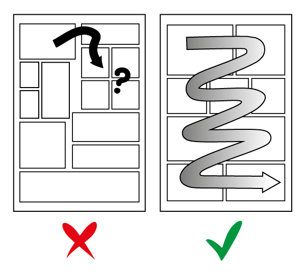
People read in “Z” order (left to right, top to bottom). If you disrupt that order without properly guiding the reader, you risk throwing off the flow of your page.
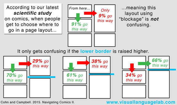
Here’s the result of an actual study to reflect this point:
- Use smaller gutters in between panels that you want to be read together. Remember, a large part of page composition is about guiding the eye to the correct next panel. When reading something, the eye naturally wants to jump to nearby panels before going to ones that are further away. By increasing the size of the gutter in between panels, you can split up a page into sections of grouped panels.
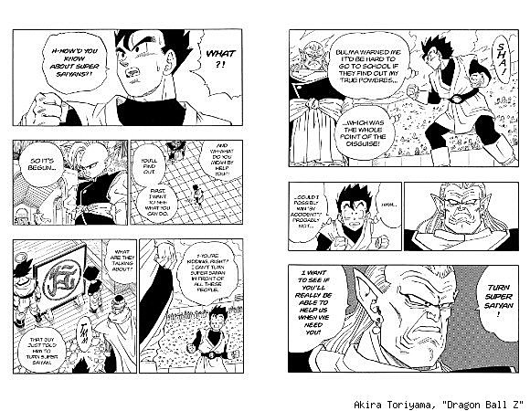
These pages from Dragon Ball Z express the point well (though you could probably get away with a more subtle approach). The divide between tiers is extremely clear, making it very obvious which panels are associated with each other. There’s little confusion as to where the reader should look next.
-
Unless you’re going for a specific effect, or are pairing panels like the previous point states, keep your gutters the same size throughout your pages. This just makes it easier for the reader to get through your pages and know what panel comes next.
-
On a similar note, you may find it useful to build guidelines for things you want to be consistent art wise in your comics. Gutter size, whether or not you want to use SFX, any colour scheme restrictions you’re imposing, whether or not you want to use borderless panels… You can check every page you make against these guidelines to help give them a consistent style. You can also choose to break these rules intentionally at certain points to add special emphasis to certain pages.
-
Vary panel structure. Mixing up panel size, placement, and count, helps keep things fresh and interesting to look at for the reader. Even 9 and 6 panel grids differ from time to time.
-
Very similarly, avoid overusing any one particular technique. If every single page in your book is a splash page, then none of them are. The fewer times you use a trick, the more impactful it is when you actually end up using it.
-
Consider the rhythmic flow of your panels. The size and placement of panels within a page can have a great effect on how the page is read. There are a few factors that determine the flow of a page:
- Know when to pair panels on the same tier and when to split them up.

By keeping panels in the same tier, we maintain a steady rhythm between them. The only pause is the time the eye takes to cross the gutter between the panels. By splitting panels into their own tiers, the eye has a much longer distance to cover to get to the next panel. This introduces a beat/pause in the flow of reading. A new tier can be introduced if a significant amount of time passes between two panels, or if you want to add a dramatic or comedic pause between them. Here’s a video that covers this point.
- Use large panels to slow the reader down. Big panels take longer to read because there’s more stuff in them. This is useful when establishing a new scene when you usually want to reset the pacing. Large panels are also used in climactic moments when you have something major to reveal.
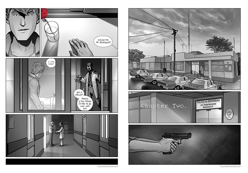 Towards Eden - Lo Vicente
There’s a scene change that occurs between these two pages. The large first panel on the second page not only helps establish setting, it also resets the pacing established by the previous page and eases us into the next chapter of the story.
- On the flip side, use more narrow panels to build tension.
Narrow panels pull the reader quickly through the page. This ramps up the pacing similar to how movies make lots of jump cuts in action scenes.
-
Also, you can use similarly sized panels to maintain a steady flow. Similarly sized panels take a similar amount of time to read. Having a series of these panels in a row can reflect a constant, unfaltering rhythm. This can be used to show a multitude of things: The monotony of a boring day job, ticking on, and on. A character dancing with perfect consistency. Two or more characters working together in complete uniform… The six, nine and twelve panel grid page layouts frequently take advantage of this idea. Here’s a great video on the topic. If you want more info about how and why the nine panel grid is used, check out this video and this one. Here’s one on the twelve panel grid.
-
Conversely, varying the size and structure of your panels makes a page feel more dynamic.
Changing up what kinds of panels you use allows for some moments to last longer than others and forces the reader to play a more active role in the story, as their eye is constantly searching for where to look next on the page. A highly varied panel structure is often used in action scenes to show things being more chaotic.
-
Borderless panels can be used as emphasis or to create a feeling of timelessness.
By bleeding a panel to the edges of a page, the reader gets the feeling that it continues beyond the page. This can be used to imply scale, to freeze a moment in time, or to amplify an emotional effect such as loneliness.
Table of Contents
Intro
Before You Start
Writing
- Overview
- It All Starts With An Idea
- Thought Dumping
- Outlining
- World Building
- Characters
- Writing Scenes
- Breaking Scenes Down
- Scripts
- Dialogue
- Revision
- Choosing A Title
- Writer's Block
Hiring A Team
- Overview
- Sorting Out Your Budget
- Writing A Solicitation
- Where To Find Your Team
- What Makes A Good Partner
- Contracts
Drawing
Colouring
Lettering
- Overview
- General Tips
- Standard Black vs Rich Black
- Choosing A Font
- Font Types
- When To Bold Text
- Sound Effects
Marketing
Publishing
Printing
- Overview
- Getting Print Ready Files
- Offset vs Digital Printers
- Why Page Count Matters
- Book Formats And Binding Types
- How Many Copies To Print
- Aesthetics
- Tips For Saving Money
- Printer Comparison Table