Choosing A Font
A big part of the lettering process is actually choosing what font to use, but before we do so, I want to discuss a question that I see come up a lot when it comes to lettering:
Should lettering be invisible?
There’s a common belief that comic lettering shouldn’t attract attention to itself. It should be essentially invisible to the reader.
I believe the reason why this is taught is because bad lettering is very obvious and can be a huge turn off for readers. Lettering as simply as possible is the safest option. While it won’t add anything to the comic, it probably won’t detract from it either.
Even though there’s nothing really wrong with that approach, I feel like it misses out on all the opportunities that lettering has to enhance a comic.
There’s so much you can do with lettering:
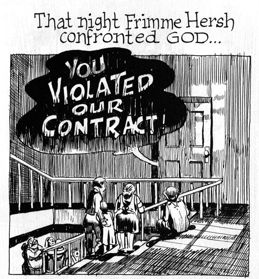 A Contract With God - Will Eisner
-
Lettering can directly interact with the art to reinforce the tone of the book or add emphasis to key moments.
-
It can be used as a physical barrier between characters to show division.
-
It can be big and bold to amplify action scenes. But at the same time it can be jarring, and end up pulling the reader out of the story if done incorrectly.
To sum it all up: When in doubt, keep the lettering simple, but don’t be afraid of letting it shine through when it has something to add.
What Font To Use
There are thousands upon thousands of fonts out there to choose from, so how do you know which is best for you?
Here are a few questions you can ask yourself to help narrow your selection:
-
What tone do I want to portray? Different fonts give off different vibes. Some are creepy, others are sophisticated, others are robotic. The font you choose should match the tone of your story.
-
What blends well with the art? You don’t want your letters to just sit on top of your art. Examine the line width and curvature of the art and complement it with the lettering. At the very least your letters shouldn’t detract from the art.
-
Would an all uppercase font or a sentence case fit best? Once upon a time, comic lettering used to be all uppercase. This is because when hand lettering, uppercase text takes up less space on the page. Nowadays, more and more comics are using normal sentence case. I don’t have a rule for which to use in every situation, but some things to note:
-
All uppercase text gives for a more traditional/classic look. It stands out on the page and feels distinct since all uppercase is only really used in comics.
-
Uppercase is louder/more intense. It’s a good fit for action heavy/superhero stories.
-
Sentence case reads more naturally. It’s calmer and so works well for more subtle stories.
-
Sentence case gives you more flexibility, allowing you to reserve uppercase for moments of emphasis.
-
Hand Lettering
A Guide to Hand-Lettering Your Strips - Chris Flick
Lettering with Ames Guide - David Marshall
If your art is done traditionally with pen and ink, you might want to consider hand lettering your pages to match.
Some people struggle with blending digital lettering in with traditionally inked and coloured art, finding that the lettering sticks out too much. Hand lettering a comic can be just as hard to pull off though and requires a lot of work compared to digital lettering.
Hand lettering is almost always done with the AMES guide, a tool for spacing out your lines and keeping them straight.
While I haven’t attempted hand lettering myself, I’ve linked to a few tutorials above that can help you get started with the AMES tool.
Ultimately the choice between hand lettered and digital is a stylistic one and something I can’t decide for you. When making the decision, choose the option that blends best with the art and if possible, enhances it somehow.
If you’re worried about the extra work required, there’s a neat tool called Calligraphr that turns your handwriting into a digital font. I haven’t used it myself but I’ve heard good things.
Font Websites
Here’s a list of sites where you can get digital fonts from. Make sure to check the licensing before using a font commercially!
Table of Contents
Intro
Before You Start
Writing
- Overview
- It All Starts With An Idea
- Thought Dumping
- Outlining
- World Building
- Characters
- Writing Scenes
- Breaking Scenes Down
- Scripts
- Dialogue
- Revision
- Choosing A Title
- Writer's Block
Hiring A Team
- Overview
- Sorting Out Your Budget
- Writing A Solicitation
- Where To Find Your Team
- What Makes A Good Partner
- Contracts
Drawing
Colouring
Lettering
- Overview
- General Tips
- Standard Black vs Rich Black
- Choosing A Font
- Font Types
- When To Bold Text
- Sound Effects
Marketing
Publishing
Printing
- Overview
- Getting Print Ready Files
- Offset vs Digital Printers
- Why Page Count Matters
- Book Formats And Binding Types
- How Many Copies To Print
- Aesthetics
- Tips For Saving Money
- Printer Comparison Table