General Tips
Here’s some basic but important technical points that I’ve seen plenty of letterers mess up on:
-
Generally, it’s better to keep your panel borders thicker than your balloon borders. The panel is what divides up the sections of your page, and thus it should have the most dominant lines. This is to help maintain the feeling that dialogue is a part of the panel and not sitting on top of it. Some letterers choose to not even use borders on their balloons. That said, many artists choose to make their panel and balloon borders the same size. This works as well, as it allows the balloons and borders to blend into each other in interesting ways. Sound effects or especially loud dialogue can be an exception to this rule if you want them to be more prominent or have the 3D effect of bursting out of the page.
-
Be weary of using serif fonts.
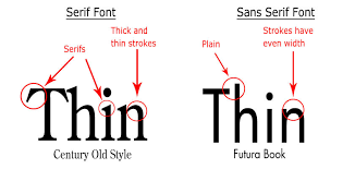
While serif fonts are fine for prose books, using them in comic lettering, which is often printed small with little line spacing, can result in dialogue that’s hard to read. This isn’t to say you can’t ever use serif fonts in your comics, just be weary of readability if you do.
-
If you’re lettering in all caps, only use the crossbar “I” if it’s at the start of a proper-noun or the word “I”, otherwise use the non-crossbar version (the one that looks like a lowercase “L”). This was originally done to save space on the page but it has become a standard in comics. Nate Piekos has a good example of this. An easy solution for this is to turn auto-ligatures on in your lettering software (if your font supports it).
-
Text within a bubble should be diamond shaped. Keep the widest parts in the middle to maximize the use of the balloon and maintain even spacing.
-
Make sure to apply proper kerning to your letters. Different combinations of letters have different amounts of space between them. For example, the space between the letters in “AV” can be much smaller than in the letters “AM”. Some fonts don’t account for this, and so if you don’t manually even out those gaps, your words will end up having strange spaces between their letters. (Relevant xkcd).
-
Keep the space between the text and the border (AKA the negative space) consistent around the entirety of each balloon. This keeps the balloon clean and balanced, and makes sure you’re using the space efficiently. This rule is sometimes intentionally broken by warping the balloon slightly. This is done to create a more stylistic or raw feel.
-
Similarly, keep negative space and font size consistent across balloons. Different sized text and negative space are used to represent someone whispering or yelling. When someone is whispering, their text is often smaller, and the negative space in the balloon is made larger as emphasis. The inverse is true for shouting. Make sure to stay consistent across your “normal” balloons so the reader clearly knows when something abnormal is happening.
-
Point the tail of a balloon to the mouth of the talker. This guides the eye to the right place. People don’t talk with their chest or their forehead!
-
The length of your balloon tail matters. Longer balloon tails can be used to show distance or the scale of a scene (this is great for establishing shots) or for when someone is shouting. Shorter tails are the opposite and can be used to show intimacy or someone talking quietly. In general, it’s a good idea to avoid very long balloon tails. They tend to look unnatural and end up disconnecting the speaker from their words. If you absolutely must use a long tail, try making it more dynamic.
-
Keep balloon tail width consistent. The width of the tail at the point where it touches the balloon should be consistent in size throughout all your balloons. The width of the tail has a similar effect to the length, in that wider tails imply a louder noise. This effect should be treated with more subtlety however, since it’s easy to make tails look too skinny or too bloated.
-
Try not to put your balloons horizontally or vertically parallel to a speaker. This results in extending tails from the exact sides, top, or bottom of balloons and makes the whole thing look static. Non-parallel lines add fluidity and movement to an image.
-
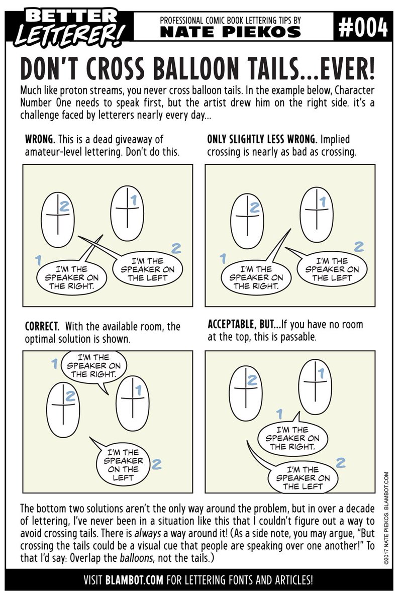
Don’t cross balloon tails. It’s just confusing for the reader. I’d argue that this could be done on purpose to show a loud, jumbled scene.
-
Avoid tangent lines. Like in the line art, tangent lines on dialogue balloons and tails can make them seem attached to things when they shouldn’t be. Avoid them whenever possible.
-
Extend the tail of the balloon from it’s center. This makes the balloon feel properly weighted. If you are connecting multiple balloons together with a single tail, the tail should go through the center of all of them.
-
The closer balloons are together, the faster they’ll be read in succession. As the reader’s eye travels through a panel, they get the illusion of time passing. If you put balloons closer together, they’ll seem like they occur within a smaller amount of time. Butting balloons up against each other shows that one is said immediately after the other. This often implies one character interrupting another. This takes me to my next point:
-
Don’t put balloons in adjacent panels right next to each other unless you want the reader to move there immediately. By putting two balloons close together, you’re associating the two for the reader, implying that you want them to look at the second balloon right after the first. Oftentimes adjacent balloons are placed too close to each other, resulting in the reader skipping over the rest of the panel.
-
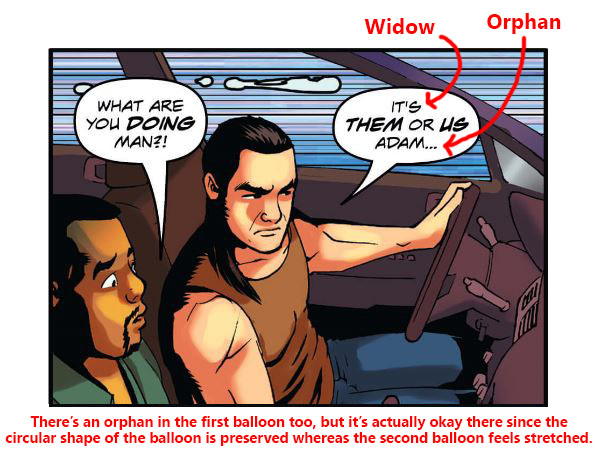
Avoid widows and orphans. Weird names, I know. Widows (using just a single word as the first line of a dialogue balloon) and orphans (using a single word on the last line) generally make your balloons feel uneven. This can be okay depending on the word, but short words like “a”, “I’m” and “the” tend to look weird on their own.
-
In general, balloon tails should extend out half the distance from the balloon to the speaker’s mouth. This isn’t a hard and fast rule but is usually a safe bet. An exception to this is if it violates the following two points.
-
Don’t cover up key art with balloons or their tails. This generally applies to faces but not always. This also includes depth cues. Covering up areas that contain the barriers between foreground and background elements ends up flattening the image.
-
Don’t block the speaker’s line of sight with their word balloons or captions. It can confuse the reader (because it seems like the character is looking at their own words) and often detracts from the moment you’re trying to create. The difference can be seen by switching from this to this. That said, this effect can be used intentionally to show a disconnect between characters.
-
Be consistent with the shape of your balloon tails. Whether you want to use curved or straight tails, stick with one choice throughout your comic. Consistency helps normalize elements for your reader. Once you’ve set a baseline, you can switch it up in certain moments to show emphasis (straight lines for an abrupt statement) or to express how different characters talk (a sly, shady character might have curvy tails that wraps around the other elements within the panel).
-
Use balloons to guide the eye through the page. Here’s a great guide by Chris Oatley that covers a whole bunch of ways to do this.
-
Generally, you don’t want more than 20-25 words in a single balloon. This number is an approximation of course, but the main goal is to keep a panel from feeling overly bloated with text.
-
Consider whether you want the art or the lettering to be seen first. Unless there’s a mandatory sequential order to the lettering and the visuals, you generally want to put the most impactful piece last to give your readers a chance to linger on it. If your panel is someone punching someone else while yelling “Gahh!”, the punch in the face is probably the more important piece and therefore would come after the dialogue. This is especially emphasized on the final panel of a page. The reader will be hanging on whatever you show them last, whether it be the art or the lettering, until they turn the page. Which will leave the bigger impact? Put that one last. This video by NerdSync covers this point well.
-
Make sure to handle quotes and dialogue in captions properly. I find this one a bit more subjective but still, a standard exists.
Table of Contents
Intro
Before You Start
Writing
- Overview
- It All Starts With An Idea
- Thought Dumping
- Outlining
- World Building
- Characters
- Writing Scenes
- Breaking Scenes Down
- Scripts
- Dialogue
- Revision
- Choosing A Title
- Writer's Block
Hiring A Team
- Overview
- Sorting Out Your Budget
- Writing A Solicitation
- Where To Find Your Team
- What Makes A Good Partner
- Contracts
Drawing
Colouring
Lettering
- Overview
- General Tips
- Standard Black vs Rich Black
- Choosing A Font
- Font Types
- When To Bold Text
- Sound Effects
Marketing
Publishing
Printing
- Overview
- Getting Print Ready Files
- Offset vs Digital Printers
- Why Page Count Matters
- Book Formats And Binding Types
- How Many Copies To Print
- Aesthetics
- Tips For Saving Money
- Printer Comparison Table